
In the reality of web projects, the reasons for testing accessibility before a formal RGAA audit are manifold: to verify what has been delivered by a contractor, to raise awareness among teams, to prepare a budget, or to understand the current state of a site.
This article proposes a series of simple tests, achievable without advanced expertise, for identifying signals of non-accessibility. These tests are not intended to measure regulatory compliance but to identify obvious barriers that directly impact user experience. They do not constitute either an RGAA audit or a compliance assessment and do not, under any circumstances, declare a site accessible. However, they do allow for the anticipation of critical points and a better understanding of what a formal audit would highlight.
Why conduct accessibility tests before an RGAA audit?
The RGAA audit remains the sole reference for assessing a website's compliance with accessibility standards in France.
However, in many contexts, it is relevant to carry out a first level of verification. These tests make it possible to detect blocking issues before going into production, to prioritise corrections, or to objectify the real state of a site.
They also represent a first educational step: they make visible difficulties that are often invisible to the teams designing or managing the site.
1 – Test keyboard navigation (without a mouse)
The first test involves navigating the website without using the mouse, relying solely on the keyboard. Practically, this means using the Tab and Shift+Tab keys to move between interactive elements, Enter to activate links and buttons, and Escape to close modal windows or dropdown menus. This test assesses the website's ability to be used without mouse interaction, a crucial condition for many users.
This test allows for the rapid identification of several problems: keyboard-inaccessible elements, inconsistent navigation order, unclosable menus, or elements without visible focus. If a key action cannot be performed using the keyboard, the site excludes a portion of users.
2 - Check the visibility of the focus
The keyboard focus must be clearly visible on all interactive elements.
An invisible focus prevents users from navigating the interface. Focus visibility is one of the most frequently non-compliant points during RGAA audits, as it is often removed for aesthetic reasons, without assessing its impact on usability. To check this, simply navigate using the keyboard and observe if the focus remains identifiable at each step.
3 – Test display at 200% zoom%
This test involves using the browser zoom to display the page at 200% %, without changing system settings.
It allows you to detect common problems: truncated content, overlapping elements, unusable menus, or off-screen buttons.

The Sephora site zoomed in at 200% as in the example shows no major problems with the text on the homepage. Observation made in December 2025.
4 – Check the structure and hierarchy of headings
A poor heading hierarchy makes content difficult to understand, particularly for screen reader users. To evaluate the structure, you should navigate the page using only headings or links, without reading the content in detail. Headings should be explicit, hierarchical, and accurately reflect the content of their sections.
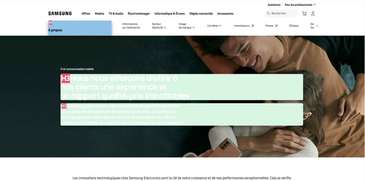
The Samsung site has consistent content on some pages and inconsistencies on others. On the IT and mobile communication page, for example, two h3s follow on from each other (highlighted on the screenshot by the Heading Tag markup extension). Observation made in December 2025.
5 – Testing form accessibility
Forms are critical points, as they determine the ability to act. To test them, simply submit a form by deliberately introducing errors. Several elements need to be checked:
- Error message comprehension
- Identification of the fields concerned
- Refocus
An inaccessible form prevents the user from completing an action, even if the content is understandable.
6 – Check alternative text for images (alt tags)
Without alternative text, visual information becomes inaccessible. A simple method is to read the page without images and check if the information remains understandable. If an image provides essential information, this must be conveyed through relevant alternative text.
See also «Informative or decorative images: making the difference in digital accessibility (RGAA)»
7 – Identify the most obvious contrast problems
Insufficient contrast can prevent access to information. Without resorting to specialised tools, certain problems are immediately apparent: light text on a light background, text on an image, and small font sizes. If reading is uncomfortable for a user without particular difficulties, it will be even more so for users with disabilities or visual fatigue.
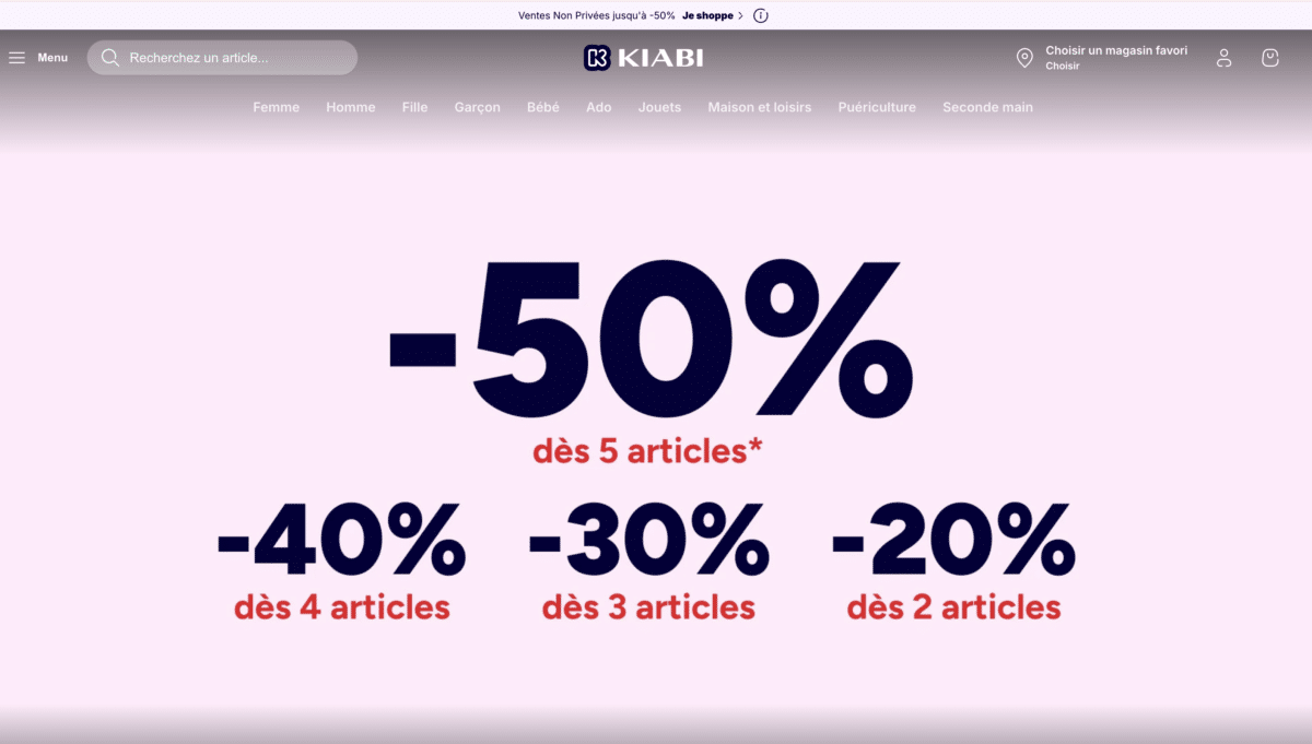
Reading the menu on the Kiabi website is uncomfortable (white text on a pale greyish pink): even without a specialised tool you can tell there is a lack of contrast. Observation made in December 2025.
These simple tests allow for the rapid detection of major obstacles, prioritisation of corrections before a formal audit, and a better understanding of accessibility challenges. They make visible problems that are often invisible to teams.
An accessibility defect is not solely a technical problem: it frequently results from design choices that have not taken into account the diversity of uses. These tests constitute a first interpretative framework accessible to all project teams. However, they do not allow for an attestation of RGAA compliance, nor do they cover all criteria. They offer a partial but operational reading of a site's accessibility status.