

When designing accessible digital services, one question constantly comes up: should this image be described or not? This apparently «simple» question actually conceals a fundamental issue, because not all images are created equal. Some convey essential information, while others serve only to enrich the visual experience. To confuse the two is to risk either unnecessarily overloading the experience of those affected, or concealing crucial information from them.
This guide offers you a clear method for distinguishing between informative and decorative images, with examples to integrate this thinking naturally into your work process.
Why make a distinction between informative and decorative images?
Images play a central role in digital services: they illustrate statements, structure pages, guide navigation and enhance content. And yet, if they are poorly qualified, they can create gaps in access to information that could have been avoided.
For blind or very visually impaired people who navigate using a screen reader, an image that conveys information without a textual alternative renders the content completely invisible, since there is no text that can be read by the screen reader. Conversely, a purely decorative image accompanied by a useless description pollutes navigation and drowns out the essential content in superfluous detail.
Visually impaired people are faced with other obstacles. When text is integrated directly into an image, it becomes impossible to enlarge it, adapt the colours or enhance the contrasts according to their needs. What should be legible remains frozen in an unsuitable format.
For people with dyslexia, this same technical constraint prevents fonts and spacing from being customised, two adjustments that are often essential to make reading easier.
How can you tell whether an image is decorative or informative?
Before any technical considerations, the simple and direct question to ask yourself is: if I delete this image, am I losing information that is necessary for understanding the content?
- If the answer is yes, Images carry information. It must be made accessible in an equivalent form, whether by a textual alternative, a detailed description or a transcription of the data it contains.
- If the answer is no, The image is decorative. It should be ignored by assistive technologies so as not to clutter up navigation unnecessarily.
This question forms the basis of any approach to image accessibility. It allows us to avoid automatisms and to treat each visual according to its context.
Informative and decorative images: how does it work?
An image is considered decorative when it does not provide any information that is essential for understanding the content.. Its role is to provide a visual accompaniment to the message, to liven up the layout or to reinforce an atmosphere, without conveying an independent message.
Decorative images are often used to illustrate the theme of an article without providing any specific information. A photo of a roaring fire in an article on Living Well at Home creates a visual context but does not change the understanding of the text. Graphic separators, textures, patterns and backgrounds also fall into this category. They contribute to the visual structure, but removing them in no way alters the meaning of the content. Finally, icons that accompany text that is already explicit: if a calendar icon precedes the words «Appointment date: 18 December 2025», it is redundant because the text is sufficient to convey the information.
Informative images convey information when they transmit content that is not provided by the surrounding text.. It is not incidental: it is an integral part of the message.
Examples:
- Computer graphics are good examples of informative images. They summarise data, draw comparisons and reveal trends. Without access to their content, the user loses a substantial part of the information.
- Graphs and diagrams work in the same way. Whether it's a trend line, a pie chart or a histogram, these visuals carry precise data that needs to be rendered in an accessible form.
- Explanatory diagrams also convey structured information. A technical diagram, an evacuation plan or a flow chart cannot be ignored: they contain relationships, stages and hierarchies that are essential to understanding.
Images containing text must always be treated with care. If this text does not appear anywhere else, the image becomes the only source of information, which poses a major accessibility problem. The same applies to images used alone to convey a message or instruction. A clickable icon with no visible text, a promotional banner with no associated text content, or a button consisting solely of a visual all carry information that must be accessible.
Practical exercises
Example 1: Photo in a news article
A press article entitled «What we know about the hacking of the Ministry of the Interior», accompanied by a photo of the entrance to the Ministry with a car passing through the gate.
Decorative or informative? Decorative. The photo provides a visual context, but the text is all you need to understand the subject.

Example 1: Photo in a news article
Example 2: Computer graphics with statistics
An infographic presenting the challenges faced by French nationals living abroad: volumes, trends, types, levels of protection.
Decorative or informative? Informative. The information is conveyed directly by the visual.
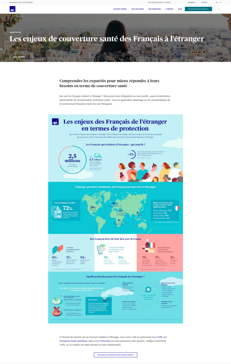
Example 2: Computer graphics with statistics
Example 3: Promotional banner
A commercial offer displayed in the form of an image: «-15 % on the entire NEVA range», with conditions and information integrated into the visual (card exclusivity and various restrictions).
Decorative or informative? Informative. The text cannot be enlarged, personalised or rendered correctly.
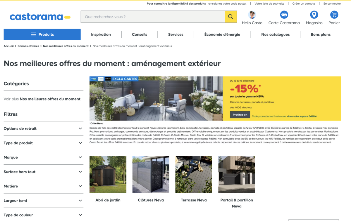
Example 3: Promotional banner
Knowing how to define whether an image in digital accessibility is informative or decorative is fundamental. Some images convey essential information, while others simply enhance the visual experience. To confuse the two is to risk either unnecessarily overloading the experience of people with an impact, or hiding crucial information from them.